Color Drenching: What It Is, Why Designers Use It and How to Do It Right
Let’s break down the soothing trend you’re seeing everywhere.

Calling all color lovers: if you’re craving an unapologetically bold, maximalist vibe at home, color drenching is your moment. This design approach wraps an entire room (walls, ceiling, trim, doors, even built-ins) in a single hue, creating a rich, monochromatic canvas that feels equal parts cozy and elevated.
While it’s having a major moment right now, color drenching is anything but fleeting. It’s a timeless technique that works across styles, from classic to contemporary, and instantly transforms any space into something intentional and immersive.
What Is Color Drenching and Why It Works
At its core, color drenching is exactly what it sounds like: saturating a space in one color from top to bottom. Instead of breaking up a room with contrasting trim or a white ceiling, everything blends together seamlessly in one continuous tone.

@mydiyjournal
Why It Feels Immersive
When every surface is the same color, your eye stops searching for edges and transitions. The result? A fully enveloping experience that feels rich, dramatic and designed. It’s less about “looking at a room” and more about being in it.
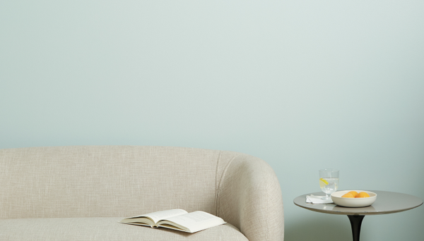
Why Color Drenched Rooms Feel Calm and Cohesive
Even bold colors can feel surprisingly soothing when used this way. Removing visual contrast reduces clutter for your eyes, creating a sense of harmony and flow. The space feels pulled together, intentional and most importantly calm.

@ashleyswhiteside
Tip 1: Try Color Drenching to Make Small Spaces Feel Bigger
Color drenching isn’t just a design flex: it’s also a smart visual trick. Carrying the same shade from walls to ceiling draws the eye upward, making ceilings feel higher and rooms feel more expansive.
It’s especially effective in smaller areas like powder rooms, home offices or compact bedrooms, where creating the illusion of space makes a big impact. The end result is seamless, elongated and surprisingly airy.

@ashleyswhiteside
Tip 2: Use it to Mask Imperfections
Got a quirky layout or less-than-ideal architectural details? Color drenching can help with that too.
Painting everything from radiators, built-ins, slanted ceilings, light switch covers or exposed pipes, the same color minimizes visual distractions. Instead of standing out, those elements blend in, becoming part of the overall design rather than something you’re trying to hide.
Tip 3: Establish Depth with Contrasting Finishes
Using one color doesn’t mean your space has to fall flat. The secret to adding dimension? Mixing finishes.
A soft eggshell finish on walls and ceilings creates a smooth, velvety backdrop, while a semi-gloss on trim, doors or cabinetry introduces a subtle sheen. Even in the same shade, this contrast in finish adds depth, texture and just enough visual interest to keep things dynamic.

@allison.crawford
Tip 4: Create a Sense of Calm
One of the biggest draws of color drenching is how instantly calming it feels. By eliminating contrast and committing to a single hue, you create a clean, uninterrupted visual experience.
This makes it especially ideal for bedrooms, reading nooks or any space where you want a relaxed, cocoon-like atmosphere. The effect is cozy, grounded and effortlessly serene.

@mrorlandosoria
How to Color Drench a Room
Ready to try it yourself? Here’s a simple approach:
Start by choosing a color you truly love; you’ll be seeing a lot of it. Then, commit to using it across all major surfaces: walls, ceiling, trim and doors. Don’t skip the ceiling! That’s what really creates the immersive effect.
Next, decide on finishes. Use a lower-sheen finish for large surfaces and a higher-sheen option for trim and high-touch areas to build subtle contrast.
 @lutzgohome
Finally, style the room with intention. You can either lean into the monochrome look with tonal decor or add contrast through furniture and textiles, it all depends on how bold you want to go.
Common Color Drenching Mistakes to Avoid
The biggest mistake? Not fully committing. Leaving the ceiling or trim a different color breaks the effect and makes the look feel incomplete.
Another common misstep is choosing a color without testing it in your space. Lighting can dramatically change how a shade appears, especially when it’s covering every surface.
Lastly, don’t forget about finish. Using the exact same sheen everywhere can make the room feel flat, mixing finishes is key to achieving that rich, layered look.
Color drenching is bold, cozy and surprisingly versatile. Whether you go deep and moody or soft and tonal, it’s a foolproof way to create a space that feels intentional, immersive and completely your own.
Tags:
We make paint shopping simple with curated colors, zero VOC paint and everything you need to create a home you love, delivered.


