5 Paint Color Pairings You Can Trust to Transform Your Space
These pairings bring out the best in each other.

Some paint color pairings are like your favorite jeans and a white tee. You didn’t overthink it. You didn’t spiral on Pinterest for three hours. They just… work.
If mixing paint colors feels intimidating, you’re not alone. But here’s the secret: great paint color pairings aren’t about following rigid rules, they’re about the perfect balance. Light and dark. Calm and bold. Cozy and crisp. When two colors complement each other naturally, your space feels intentional without trying too hard.
Below, we’re breaking down color combos that consistently click. These are the pairings you can trust to show up and do their job beautifully.
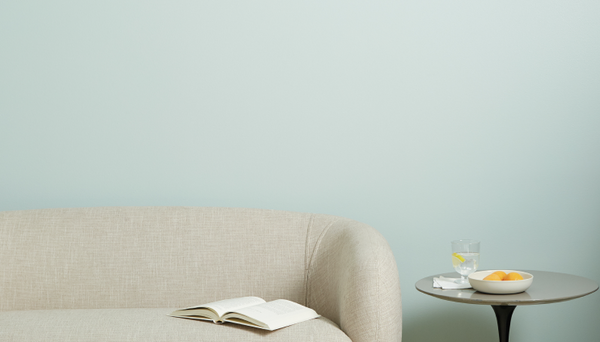
Modern and quietly confident

@brookepavel
Whipped is that soft, creamy white that makes everything feel lighter and brighter, while On Point brings a grounded greige energy that adds just enough contrast. Together, they’re effortless and polished without feeling stark.
Use Whipped on walls to keep things airy, and bring in On Point on trim, doors or cabinetry for subtle definition. This pairing works especially well in open floor plans where you want flow and structure.
Vibe: Calm, pulled-together and clean.
Neutral, but make it interesting

@whiteberryhome
Timeless is the off-white people swear they’ve been searching for forever (warm, inviting, flattering in basically any light). Dirty Martini adds a muted green that feels earthy and sophisticated.
This duo is perfect if you love neutrals but want a little extra oomph. Think Timeless on the walls, Dirty Martini on the trim, cabinets or even a ceiling if you’re feeling brave (and we support that).
Vibe: Relaxed elegance with a delicious twist.
Bold meets blush

@casa_de_car
This is proof that bold paint color pairings don’t have to feel overwhelming. Big Apple is a rich red, while Baby Soft brings a gentle, rosy balance that softens the whole space.
Try Big Apple for trim, then use Baby Soft as the base for a warm, approachable and bright vibe.
Vibe: Confident, creative, surprisingly cozy.
Bright, breezy and grounded

@ninabarniehblair
Fresh Kicks is crisp and energizing, the kind of color that instantly lifts a room. Paired with Deep Dive’s rich ocean blue depth, the result is fresh but anchored (aka: not floating away into beach-house cliché).
This pairing shines in bedrooms, bathrooms or your home office where you want a clean look with a little oomph.
Vibe: Polished, refreshing, quietly bold.
Laid back and coastal calm

@jordanaclaudia
Summer Friday brings a sun-washed softness, while Flatiron adds a crisp, modern edge. Together, they feel cozy, elevated and extremely livable.
This combo works beautifully in living rooms and bedrooms—spaces where you want warmth without heaviness. It’s the kind of pairing that looks good at golden hour or on a cloudy Tuesday.
Vibe: Effortless, soft and cool.
High contrast, zero stress

@eacourts
Crisp Classic beige paired with deep, inky Goodnight Moon is a contrast combo that never misses. It’s rich, clean and timeless.
Use Classic to keep things bright and open, then layer in Goodnight Moon on doors and trim for drama that doesn’t overwhelm. This is one of those paint color pairings that works everywhere—from modern to traditional.
Vibe: Bold, balanced, always in style.
The Takeaway: Trust your pairing
Great paint color pairings aren’t about following trends or the design rulebook. They’re about choosing two colors that balance each other, like light and dark, soft and strong, etc., and letting them do what they do best.
If you’re stuck choosing one color, try choosing two instead. When the pairing works, the whole room just clicks. And if you want help finding your perfect match? We’ve got your back.
Tags:
We make paint shopping simple with curated colors, zero VOC paint and everything you need to create a home you love, delivered.


